web banner showing a image of the Warner Library Events board

Warner Library rework

The Warner Library is the local library settled between two Westchester towns, Tarrytown and Sleepy Hollow. Along with providing books, the site provides numerous resources and activities for the community. Although the current website does provide information to the community, Sarah sought to re-design the site to ensure that the visuals and layout of the website accommodate the main populations within the community: Seniors and Spanish-speakers.

  • Date:
    2021-2022
  • Client:
    Self Initiated
  • Tool Stack:
    Figma,Wordpress,Adobe Photoshop
  • Category:
    Case Study, Mockups, Web

Two Personas, Two Needs

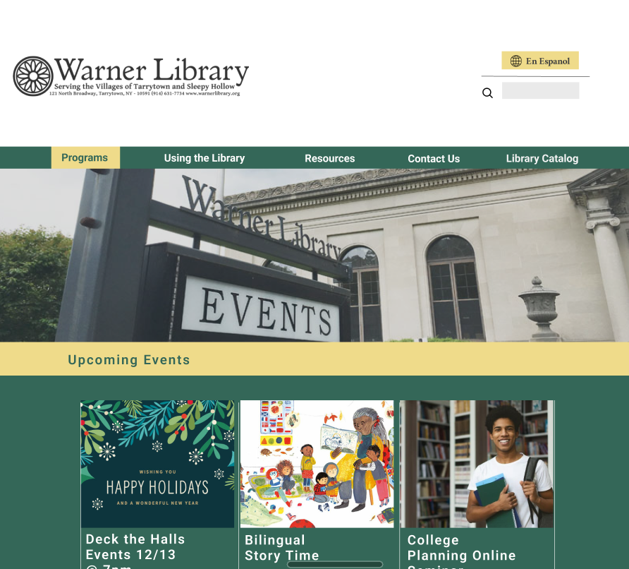
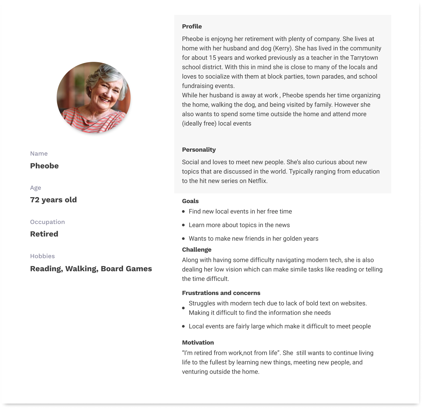
To gain an idea on who attended the library, I would occasionally stop by the library during the week for several tasks and events. From this I was able to observe and occasionally interact with attendees to gain a better idea on the populations and their needs. From what I collected in my small notepad that detailed the people I observed, most older visitors stopped by for books and events, while many Spanish speaking visitors looked for books, resources, and events for young children.

Analyze and Reaserch

Image preview of the layout of the original Warner Library Website. Must click to view full layout on Figma

Link to Website Layout

Upon looking at the current design, I made a list of several issues and inconstancies about the page. Yes, basic information was provided, but the layout can be improved to provide easier access to desired information and related information. However, I needed to collect information from the users/visitors to gain a better idea of how to change the layout. By conducting interviews with several visitors, I was to hear comments such as: “I feel like I need to keep squinting to read some of the details” and “I can't find the hours…oh! there it is” ,“It would be nice to see each page translated (into Spanish)”.

I also created a wireframe of the current website to gain a clear idea of the layout. I then studied the layout of several libraries and museums in the local area to find patterns/designs that were commonly used and easier to read. Despite focusing on a modern look, I sought to preserve certain details that remained consistent in the old websites (ex: green and gold colors, Library Logo, even Spanish translation (was a page, not a button).

Brainstorming

Image of a pencil sketch of a layout for the contents page of the website

Pencil sketches of layout ideas

Based on the needs of the populations and the layout of the current website, I started sketching the main landing page.Similar to the current Landing page, the reworked design focuses on featured events and recent updates. Images are adjusted to a larger size and text is easy to view with semi-bold text and a larger font size than previously.

For Seniors, bolder text, for Spanish-Speakers, the option of Spanish translation. Throughout the current website, there are instances of thin font and hard-to-read text, which can be difficult for low-vision visitors. As for Spanish speakers, a few events are translated into Spanish. A page does list resources in Spanish, but in a less visual format compared to the English site. For this, it would be ideal to provide similar experiences to visitors, regardless of language.

Wireframe

Based on the collected data, additions such as such larger and bolder text would allow the font to stand out without much effort from low-vision users. The footer at the bottom of the page allows users easy access to basic information about the library (address, hours, social media).

After completion, I asked the previous users from my first round to research to observe and navigate the wireframe. They appreciated the inclusion of more photos and seemed to interact a lot with the new side menu included for each page. However, after I mentioned my ideas for including several background blocks with light color hues, users were worried that this addition might make it difficult to read important text.

For the final prototype, users were observed as they explored the figma prototype on their preferred devices. Behind them I quietly jotted down their comments and behaviors. As noted, users found this site to have more “life” (because of the inclusion of photos and colors) and appreciated the nod to the colors of the old website. Few of them leaned forward or adjusted their glasses as they viewed medium-sized fonts for event details.

Spanish-speaking users enjoyed the inclusion of the Spanish translation button allowing users to gain access and context to needed information with ease after clicking. One user noted that it took "some getting used to ... but got into a habit of clicking it before going further down each page".

Conclusion /Impact

From what Users stated in interviews, the inclusion of details such as larger text provide Users with a sense of competency that older users may not feel normally when interacting with technology. With this control, older users felt comfortable revisiting their usual pages and even looking into pages they normally wouldn’t explore.

As for the Spanish speakers, the addition of the Spanish translation meant more than easy access to the websites. Although this can be interpreted as a success and the design could move on to the final stage, the option to discuss alternative methods for translations can be explored, especially with low-technology users. With this in mind, a few more rounds of testing may be needed.

Takeaways

Through this project I was able to see the results of implementing accessible tools to a website for a public institution. What I initially worked on this website project I viewed this as cleanup to fix difficult to read text, ensuring translation for Spanish speakers, and strategic re-organization of each page. However, it became something greater. The resulting page highlighted different populations and emphasizing a stronger sense of community and inclusion. The new edits of the website can better communicate to everyone in the Sleepy Hollow/Tarrytown area what events and resources they can over to the people.

More Works