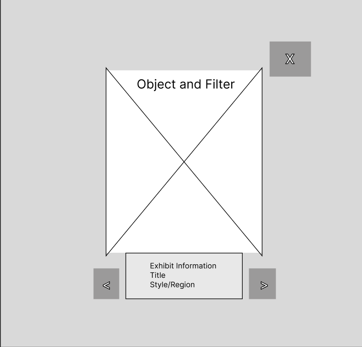
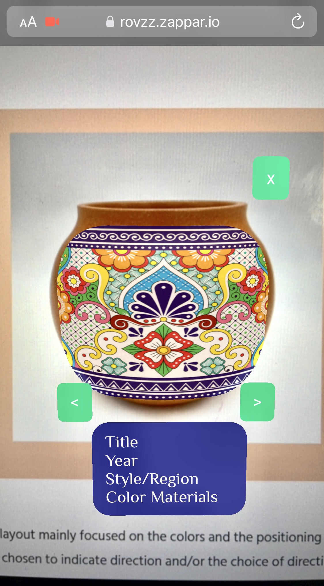
For the prototype the main additions I made in the layout mainly focused on the colors and the positioning of the navigation buttons.Additions would include: green buttons to indicate direction and/or the choice of direction, and a darker background text to highlight white text descriptions. These additions would allow for easy reading and easier multitasking while users interacted with the filters.
When tested through in-person interviews, users appeared to enjoy the simplicity of the filters. However, in regards to the navigation buttons, users felt the previous positions of the buttons were favorable. But for now, they did agree that the buttons were easier to press with one hand. Other users addressed their issues focused away from the screens. Many users felt that proper instructions on how to use the app would've led them to rate this prototype on a higher level.


