blue web banner showing the Everwalk logo

EverWalk App

Typically, when searching for walking instructions on most phone apps you are given the “fastest” directions to get to your selected destination. However fast does not equate to safety. Many individuals who are vulnerable to being attacked on the streets (especially women) hesitate to walk alone or even with others down unfamiliar locations out of fear. With this app I hope to establish a sense of confidence amongst individuals at risk to explore and gain a sense of safety with my app.

  • Date:
    2022
  • Client:
    Self-Initiated
  • Tool Stack:
    Adobe XD, Google Forms, Adobe Phototshop, Figma
  • Category:
    Case Study, Mockups, Application,Apps, Mobile (IOS)

Research

image preview of a Google Forms Questionnaire
Image of Google Forms Questionnaire

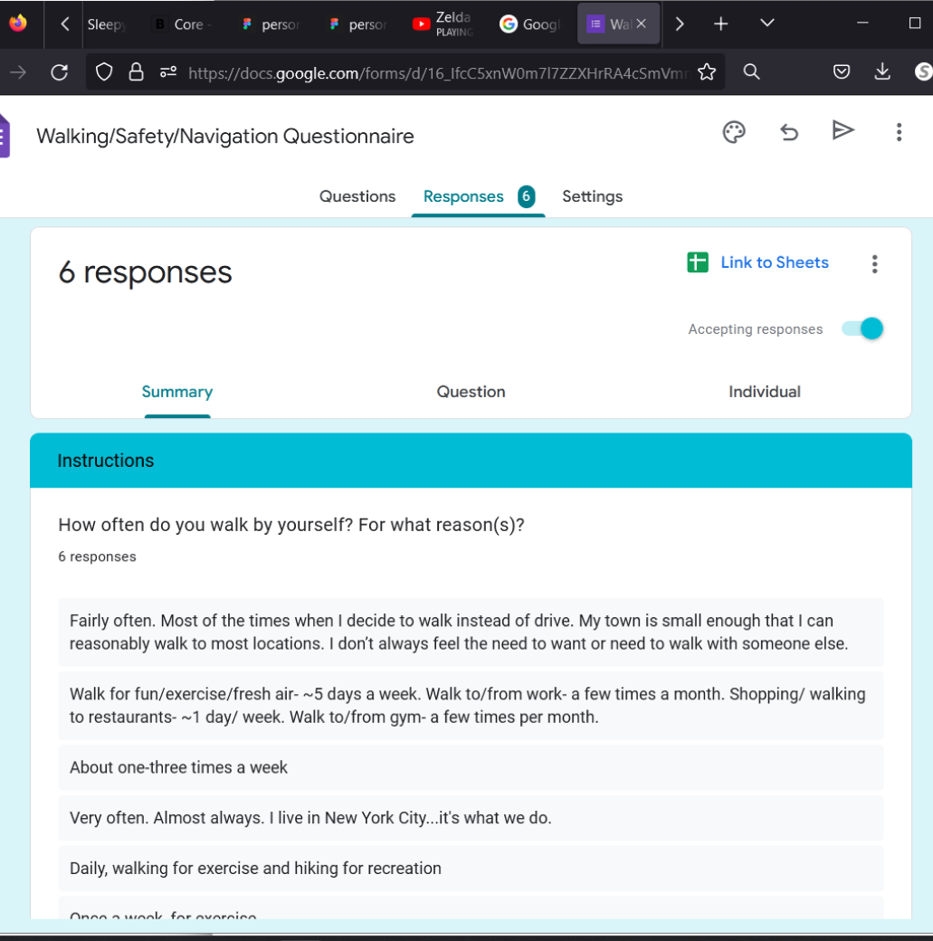
For this research I began by sending a Google Forms survey to 5 individuals around 21-29 years old. The survey consisted of several questions involving navigation, safety, and routines.Questions in the survey include:

  • “If you were to feel unsafe when walking, what location(s) or spaces would you look for to feel safe?”
  • “Do you use apps and websites when navigating (not just for walking)? Which one(s)?”
  • “If placed in a safe but unfamiliar town, what would you explore? “

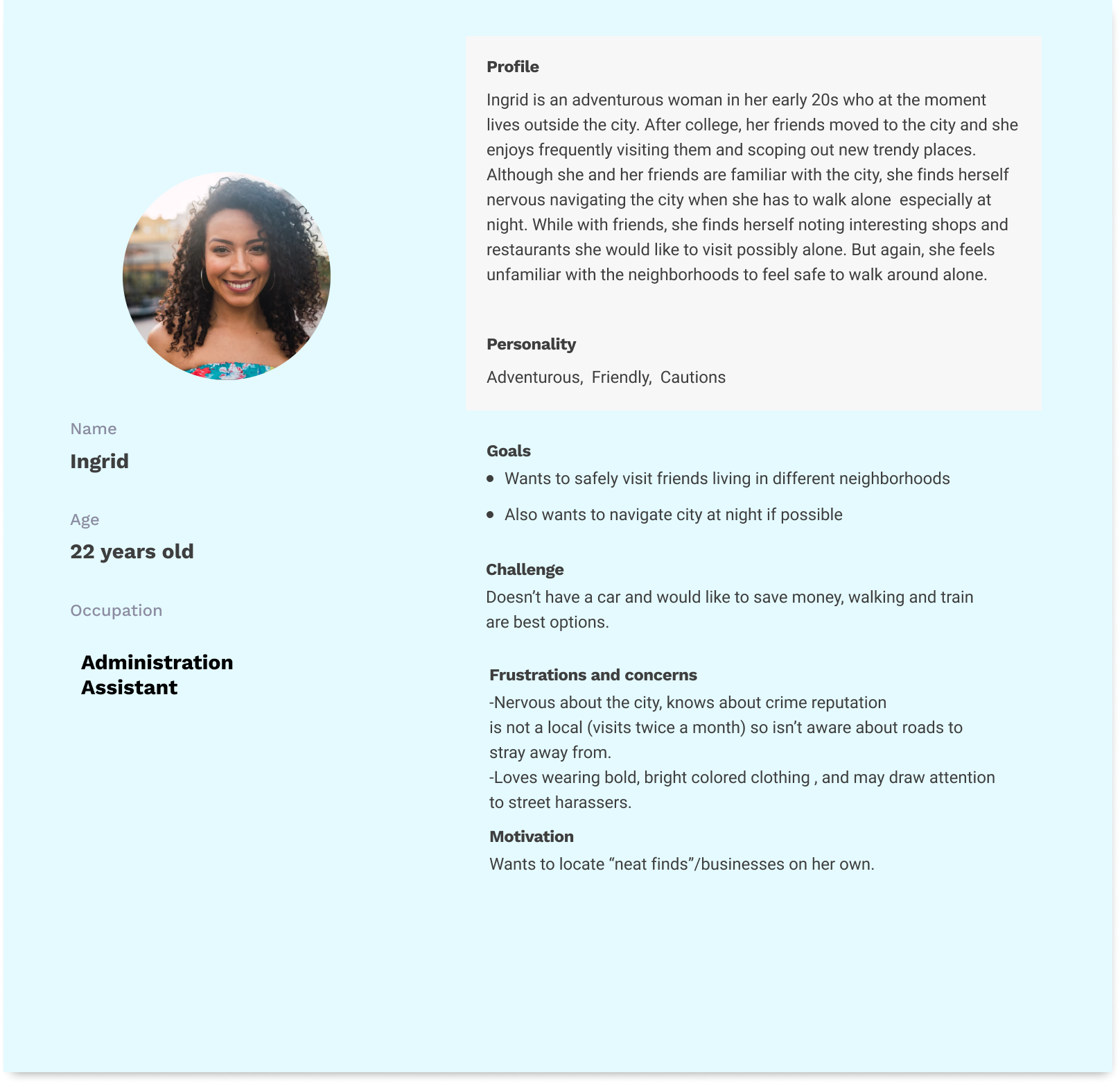
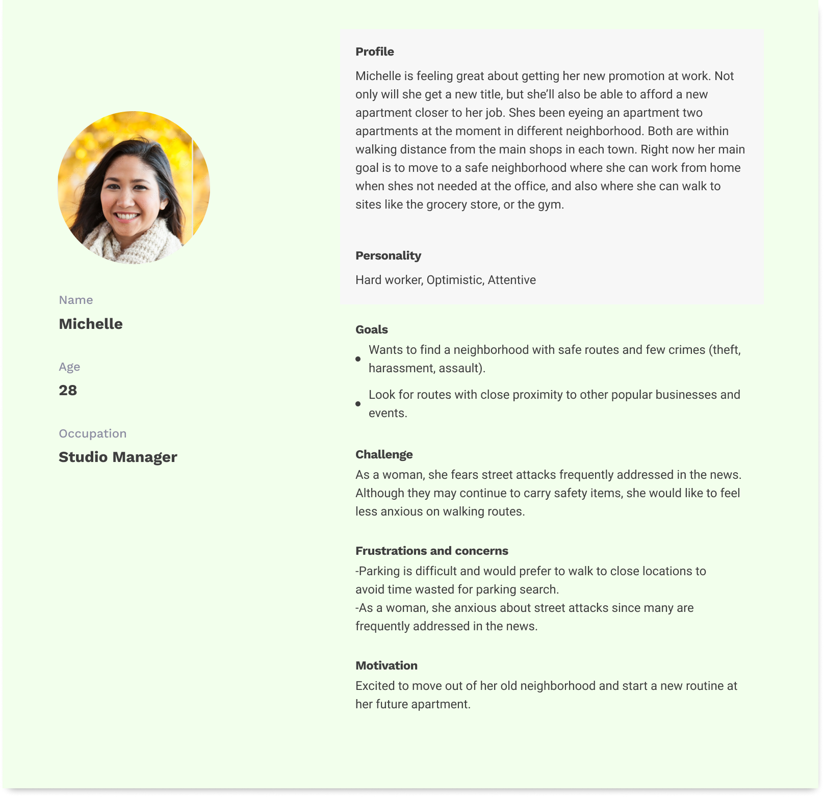
After collecting data from +5 individuals, I was able to note several worries users had including walking at night, potential threats from strangers, and unfamiliar streets (feeling lost). When users felt required to walk alone several apps were referenced including "Maps, Waze, and Life360". Based on this research, I then created two personas that best fit the demographic of the surveyed users and the target demographic.

Persona description page for a 22 year old woman named Ingrid

Persona page for a 28 year old woman named Michelle

Flow Map

image of flow map for Everwalk application experience

Image of Flow/Experience Chart

With the qualitative research complete, I then focused on creating a flow map that felt similar to the experience of most navigation and safety apps such as Apple Maps, Waze, and Life360. Marked in blue are the most common steps of the researched apps. Underneath several sections are several notes from the survey that will be included in the Wireframe.

Based on the survey responses, I had to focus on finding ways to make safe routes and outside communication easily accessible while navigating. For quick communication buttons for phone calls, messaging, location photos, and location sharing, would be available to the user during navigation in the app. Settings for streetlights, public access locations, and routes with less cars (low populated streets) can be accessed when users are contemplating their preferred routes or neighborhoods to navigate.

With the completion of the research and flowchart, it was time to organize the layout of the Wireframe. The five users who underwent the usability testing interacted with the Figma app via a sent link, and would be observed by me via video chat. From these interviews, users verbally stated their appreciation for additional settings to the navigation. Statements include:

  • “Font and directional arrows needed to be bolder...especially when we’re glancing at our phones and staying cautious”
  • “In regular app maps, we already do that awkward thing where we walk in one direction only to find out it’s the wrong way, and we feel stupid for wasting time” .

For the final details of the navigation app, Navigation arrows were enlarged, font thickness increased, and a direction orientation arrow was added into the app. To ensure continuity, I established green to mark important buttons (back button, search button, exit button) and important headlines (next direction headline, and headlines within user profile). Blue buttons (filters, compass, messaging, and calling) would indicate options when navigating.

Usability testing users did note that the inclusion of colors assisted in quick navigation of the app. They were able to quickly navigate back to their desired page in the prototype with little issue or errors. For the main navigation page, one user did note that the photo location button could be improved if “more than one photo could be included…different angles, perspectives, night pictures”.

Conclusion /Impact

Based on the interviews and data collected from the users throughout this project, users did feel assured about obtaining some level of safety with the app. Users felt as if they could easily follow navigation directions even with quick glances while they surveyed their location for safety.

However, when it comes to the safety levels of the routes users may take, there is not a 100% guarantee . Safety levels in the app determine the probability that an in-person issue may occur, but the threat of danger is always present. So, while the app may bring confidence to a user unfamiliar with a location, it only remedies minor worries when traveling.

Takeaways

As a young woman who does travel solo frequently, I felt confident that the concerns of users would resemble my own experiences when traveling. Thankfully many of these responses Instead provided me with a new light into the lives of new or inexperienced travelers. Through these answers I was highlighted of the risk of designer/developer bias that could be included in future projects.

More Works