red web banner with the words Sleepy Coffee, Too Redesign

Sleepy Coffee, Too. Redesign

Founded by Kim Kaczmarek, Coffee, Too Inc is a upcoming new café that seeks to provide employment for adult individuals with special needs. As a retired Special needs educator, Kim sought to continue assisting the community and former students beyond the school setting.Inspired by Kim’s story I offered my web services to reorganized the current version of the website if possible.

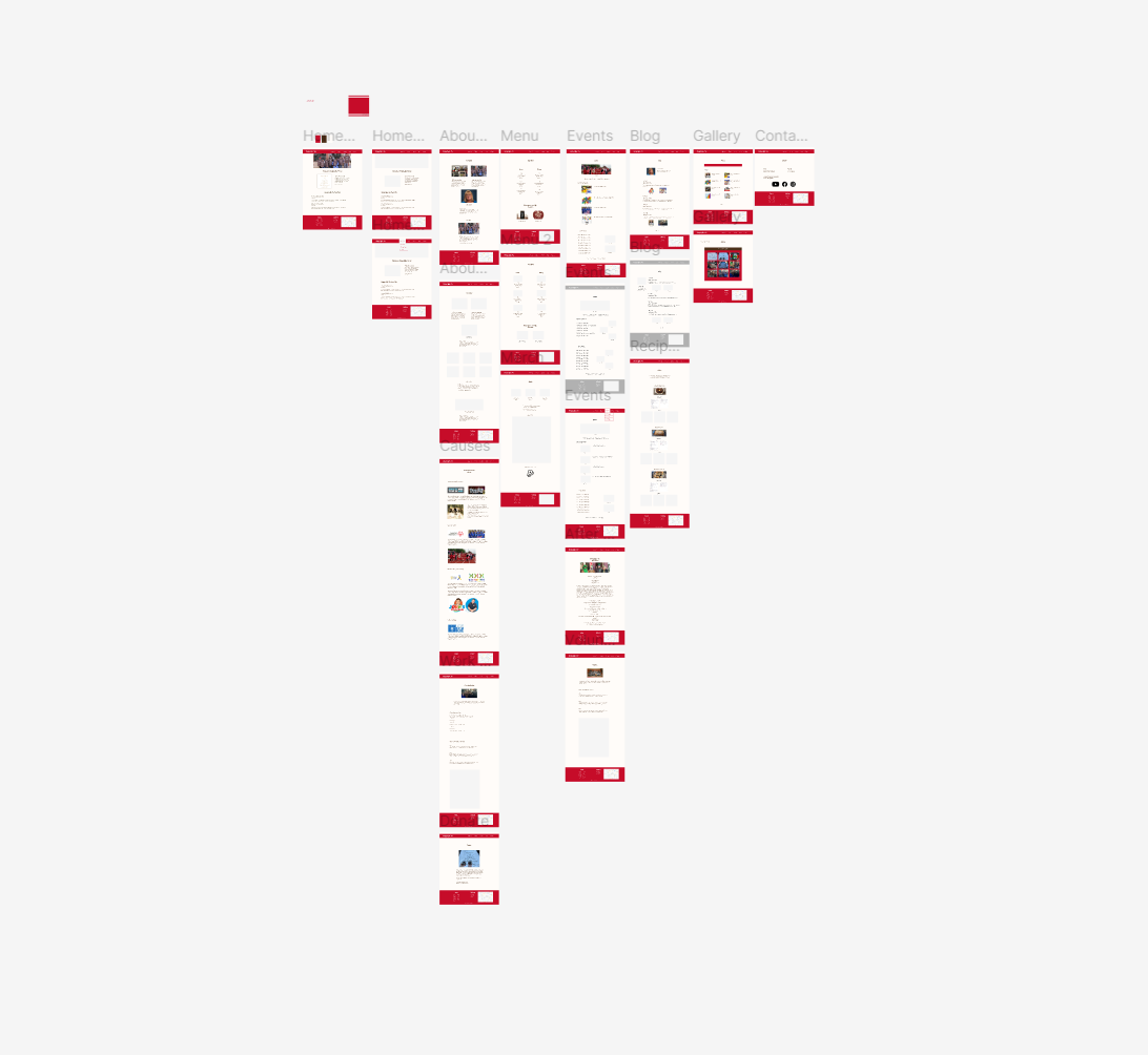
For my redesign, I mainly focused on moving the information expanded throughout the original webpage and organizing them into compact sections. However, in order to determine what minor details needed to be fixed and what information should be included in the site, I required the assistance of potential users to accomplish this task.

  • Date:
    2021-2022
  • Client:
    Sleepy Coffee, Too inc, Client initiated and approved
  • Tool Stack:
    Wordpress, Adobe Creative Cloud, Figma, Basic Coding (HTML and CSS)
  • Category:
    Reorganize, Case Study, Web

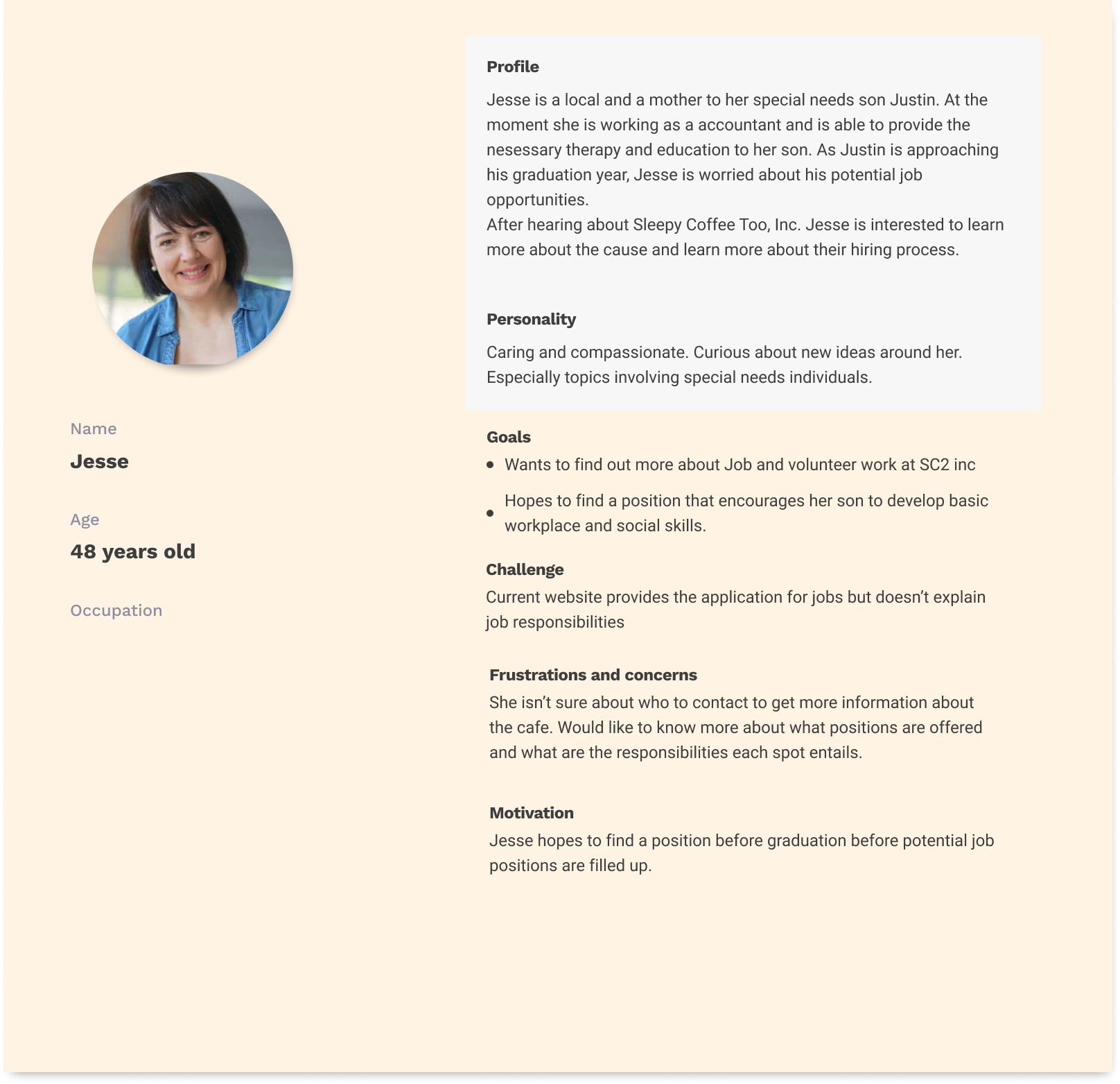
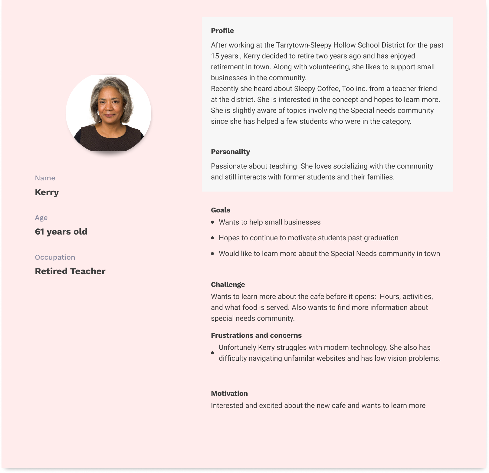
Cafe Personas

When I asked Kim during a cafe promotional event "Who do you expect to come to this cafe" she gave a simple response, "Well everyone!". According to the 2021 US Census Bureau, the population of individuals older than 65 ranges from 18-15% in both Tarrytown and Sleepy Hollow. The number is similar for individuals under 18, and a high parent/guardian population. With this in mind, I firmly believe the updated website should cater to adult community members such as parents, and the quarter of seniors who reside in the area.

Research and Interviews

A collection of yellow and green post it notes representing noted observations and behaviors under four blue post it notes that each have a unique shape drawn on them

A set of green and yellow representing comments and observations, under blue post it notes representing pain points

To properly understand the needs of users, I sought to gather information from 5 individuals, who fit my persona descriptions. For these interviews. I observed the users interacting with the website on their preferred at-home devices while I wrote down verbal comments and observations. Following this, I would ask them prewritten questions such as:

  • "Is there anything you think should be added or removed from the site?"
  • "Anything you found surprising on the site?".

After the completed interviews, I then rewrote user comments and observations(yellow-verbal, green-behavior) onto post-it notes that corresponded with a type of observation (blue notes)

Based on my method of collecting data the main pain points included details such as : hard to read font for descriptions, photos with no description, unorganized Events page. These pain points along with others were used when considering the design of the wireframe. These main pain points included:

  • Hard to read font for descriptions
  • Photos with no description
  • Unorganized pages

After establishing the need for better organization, context images, and smaller design details, it was time to start the wireframe. Once complete, I called my user group to test the wireframe. As they explored the site and detailed their findings, I took notes recording their verbal comments along with subtle behaviors. Comments included:

  • "(In the About Us section) Will there be individual staff photos, or will the staff be in one photo?"
  • "Will the top menu (background color) be darker?".

So far the biggest difference between the original and my draft was the amount of time users spend using each site. The original web site it took at max 15 minutes to explore the site, while my current design took an average 5 minutes.

In the next stage of the design, I focused on fixing noted sections in wireframe testing. Colors and images were now included in the prototype.

Like the Wireframe testing, users would be exploring the Prototype on their home computer/laptop while I sat behind and recorded observations and comments. From this new edit of the design, I was able to notice an absence of previously recorded behaviors, such as squinting and leaning towards the screen and faster exploration time. However the most asked question asked by users was:

  • “Is there a way to view a larger version of the photo when we click on it?”.

With the approval of the users, it was time to discuss the final draft of the website with the owner of the café, Kim Kaczmarek. Upon completion she appeared satisfied with the edits but requested minor changes including the removal of the Blog tab until the café is finally open.

Conclusion/Takeaways

As stated in the conclusion, I found that balancing the needs of the users and of the client to be an exciting challenged that allowed me to explore different ways to strategically organize information provided by the client. By editing the visuals and layout of an existing website, it was rewarding to see both client and users be satisfied that necessary information could be easily accessed. It was especially exciting to know that this accessibility would aid in the café’s current mission to gain support before their opening.

More Works